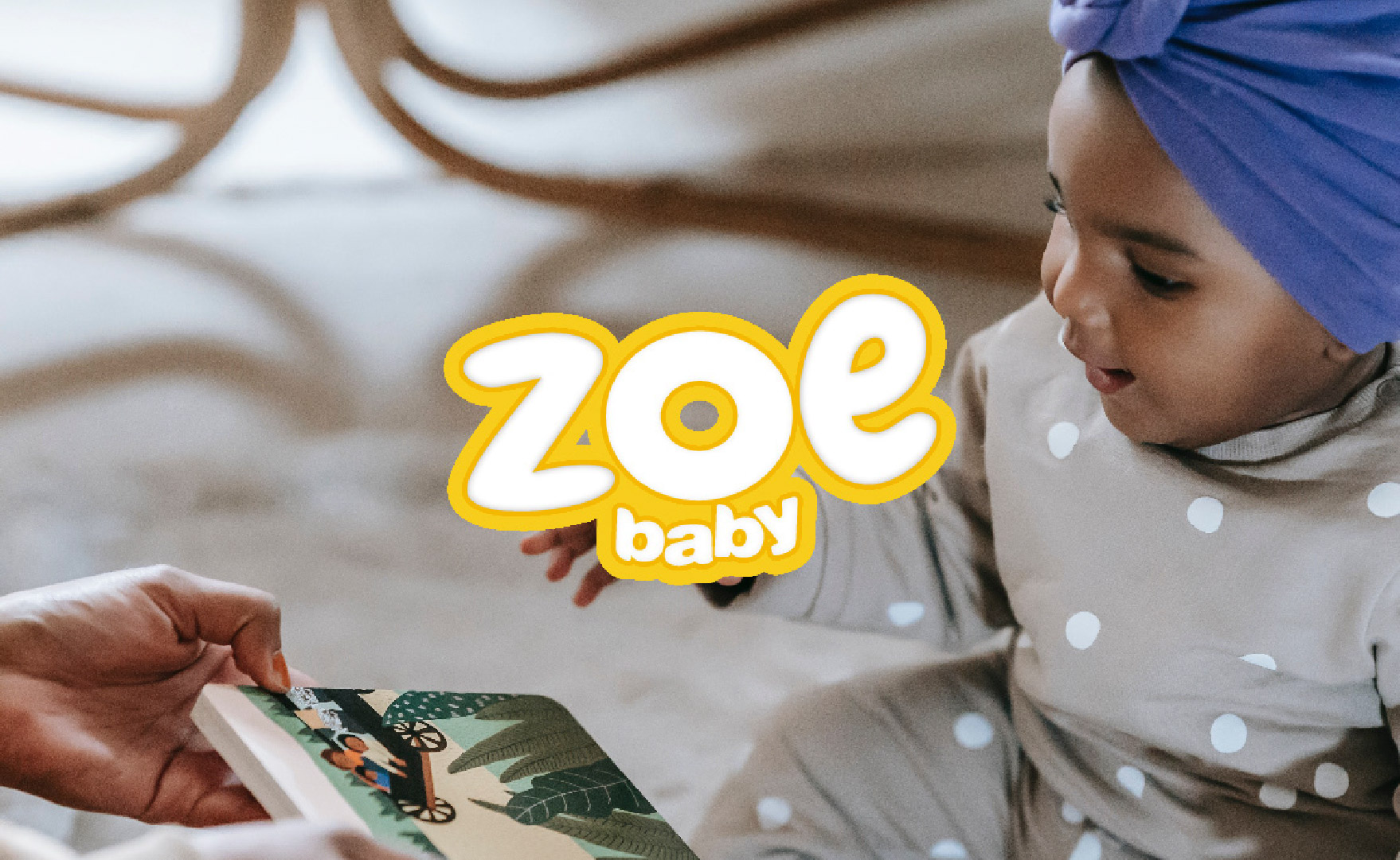
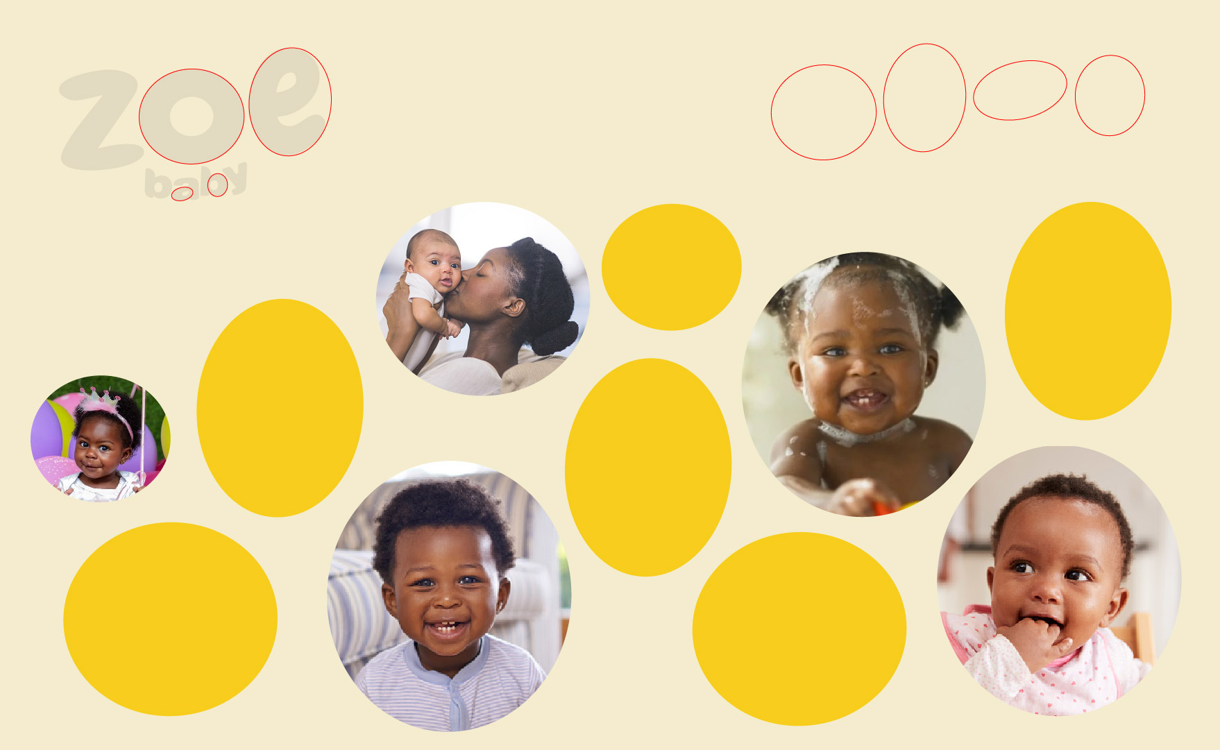
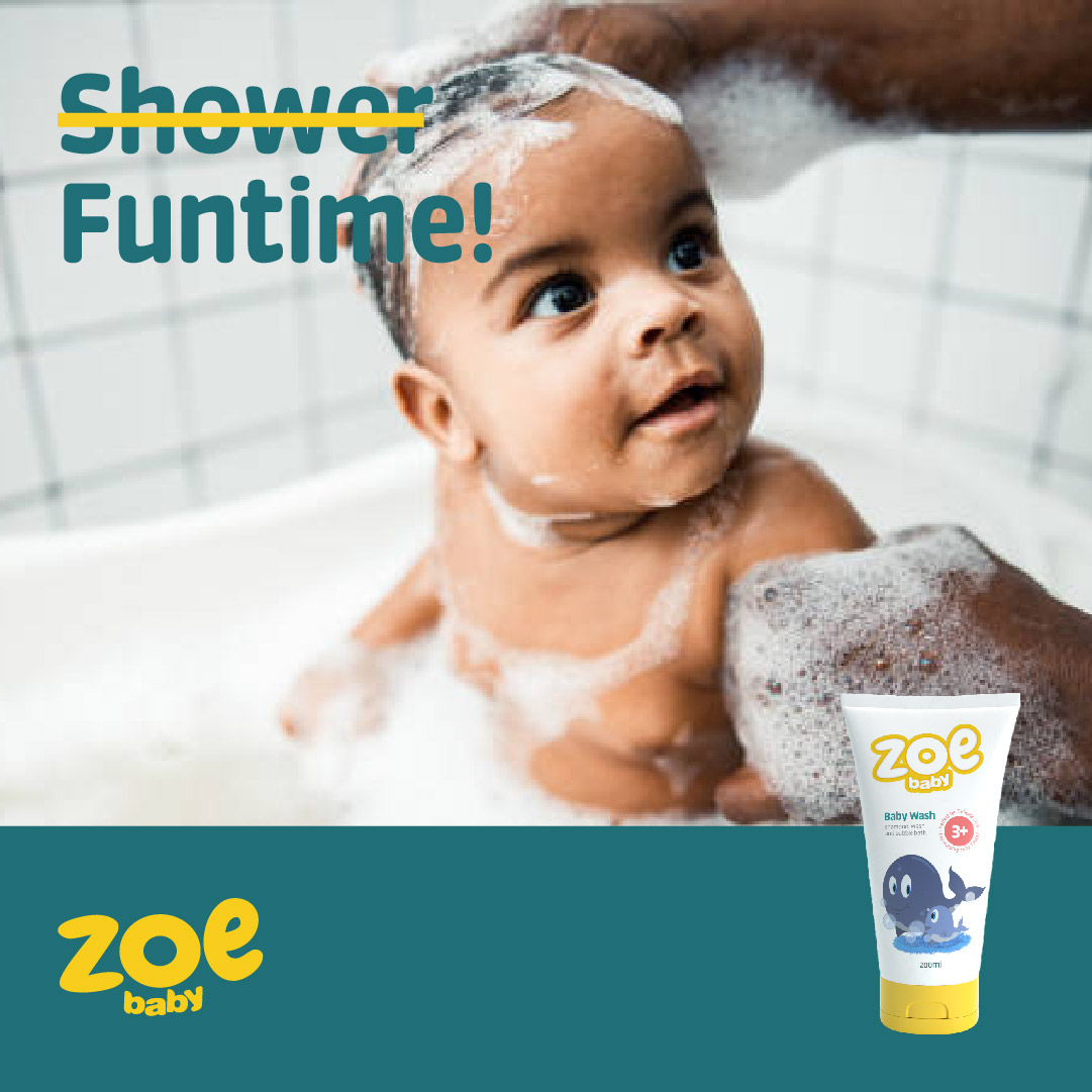
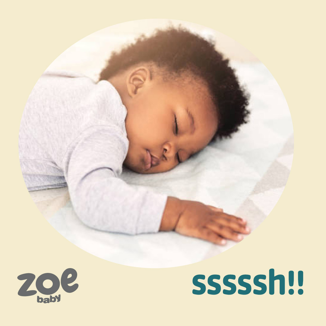
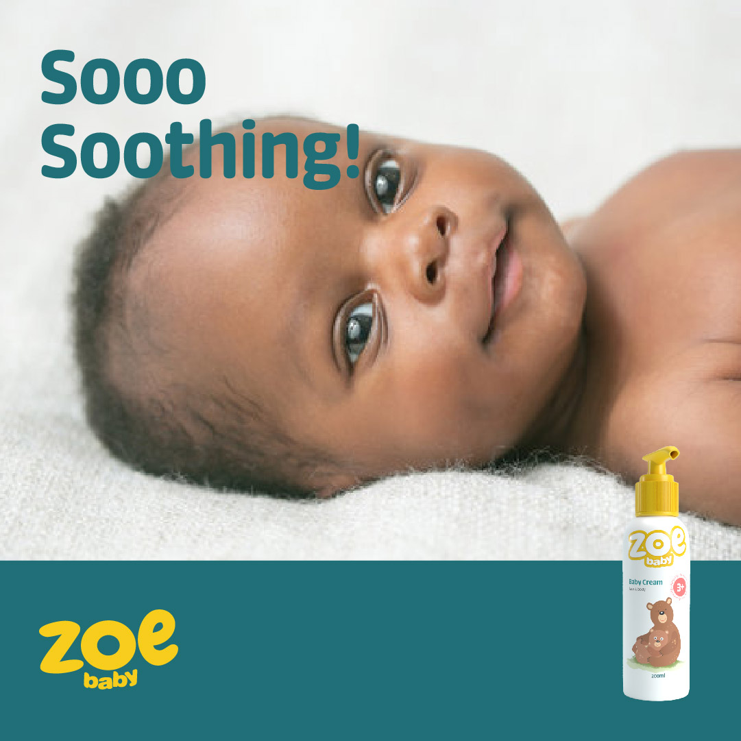
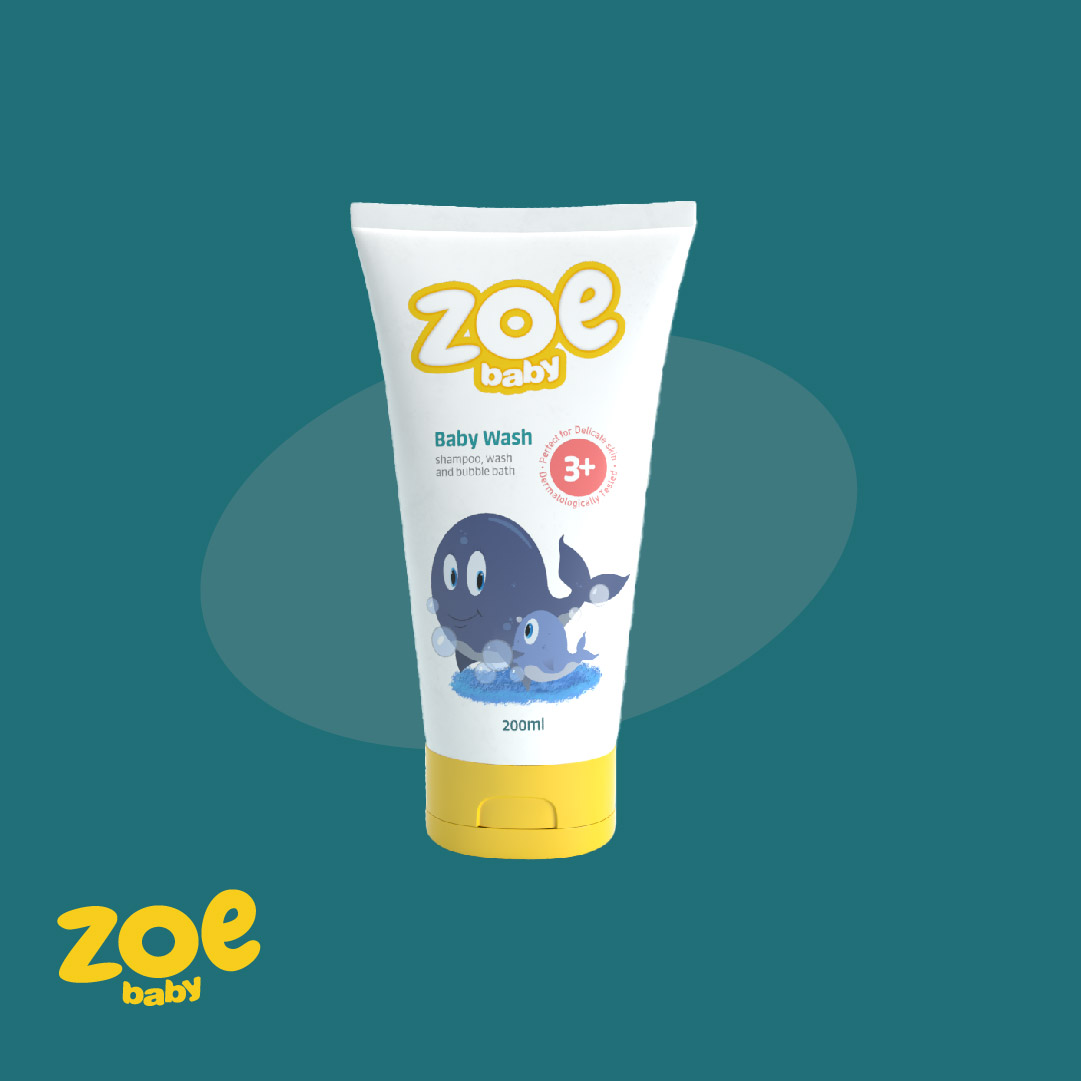
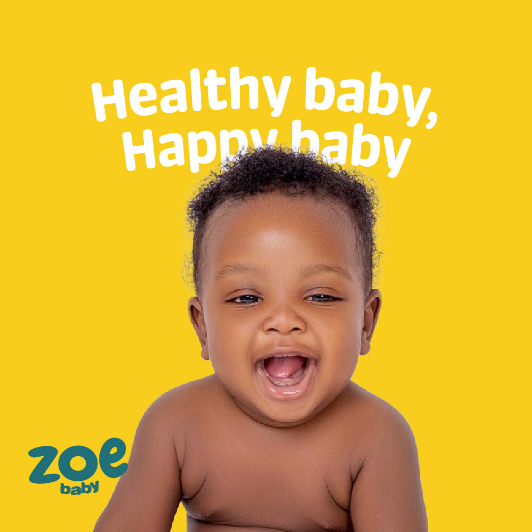
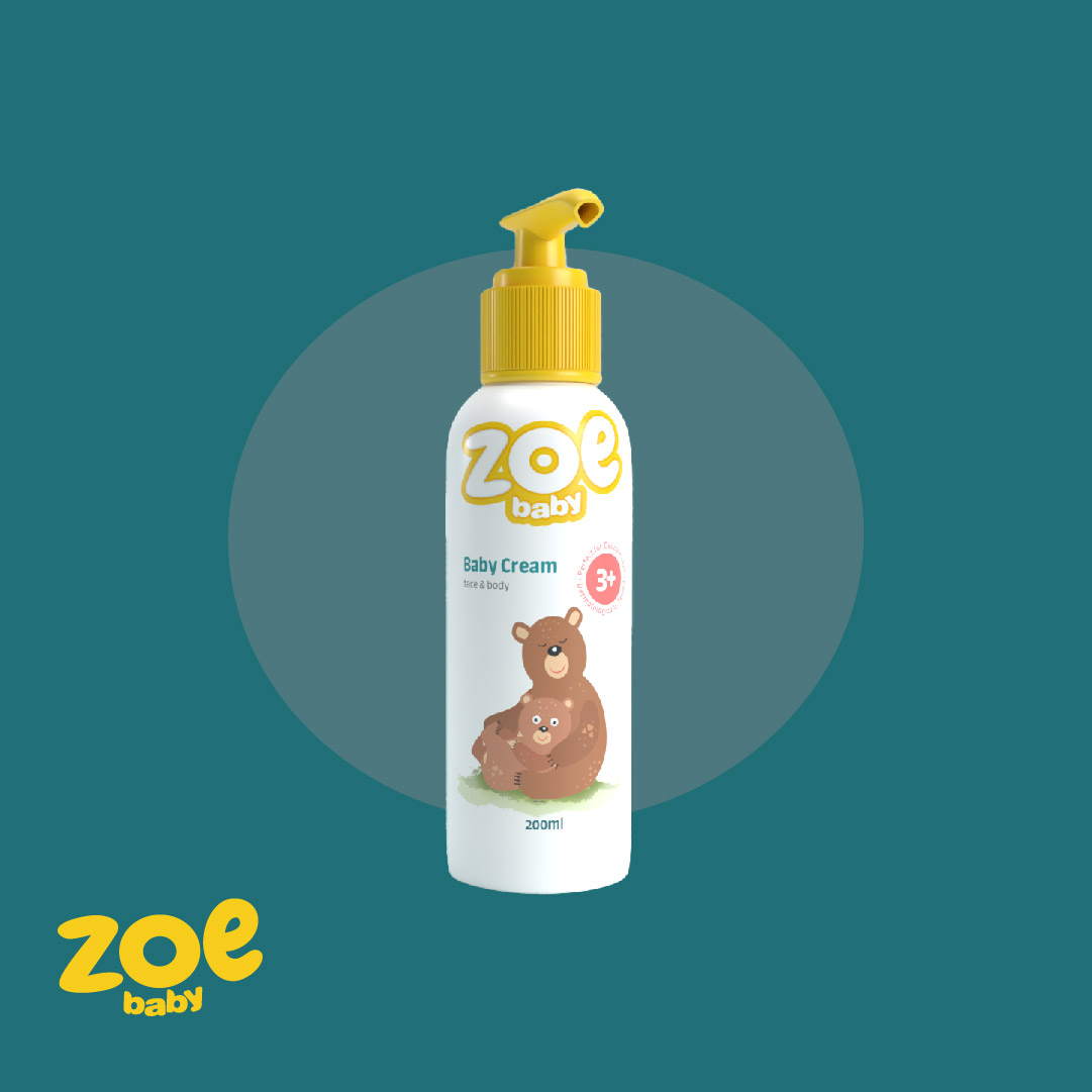
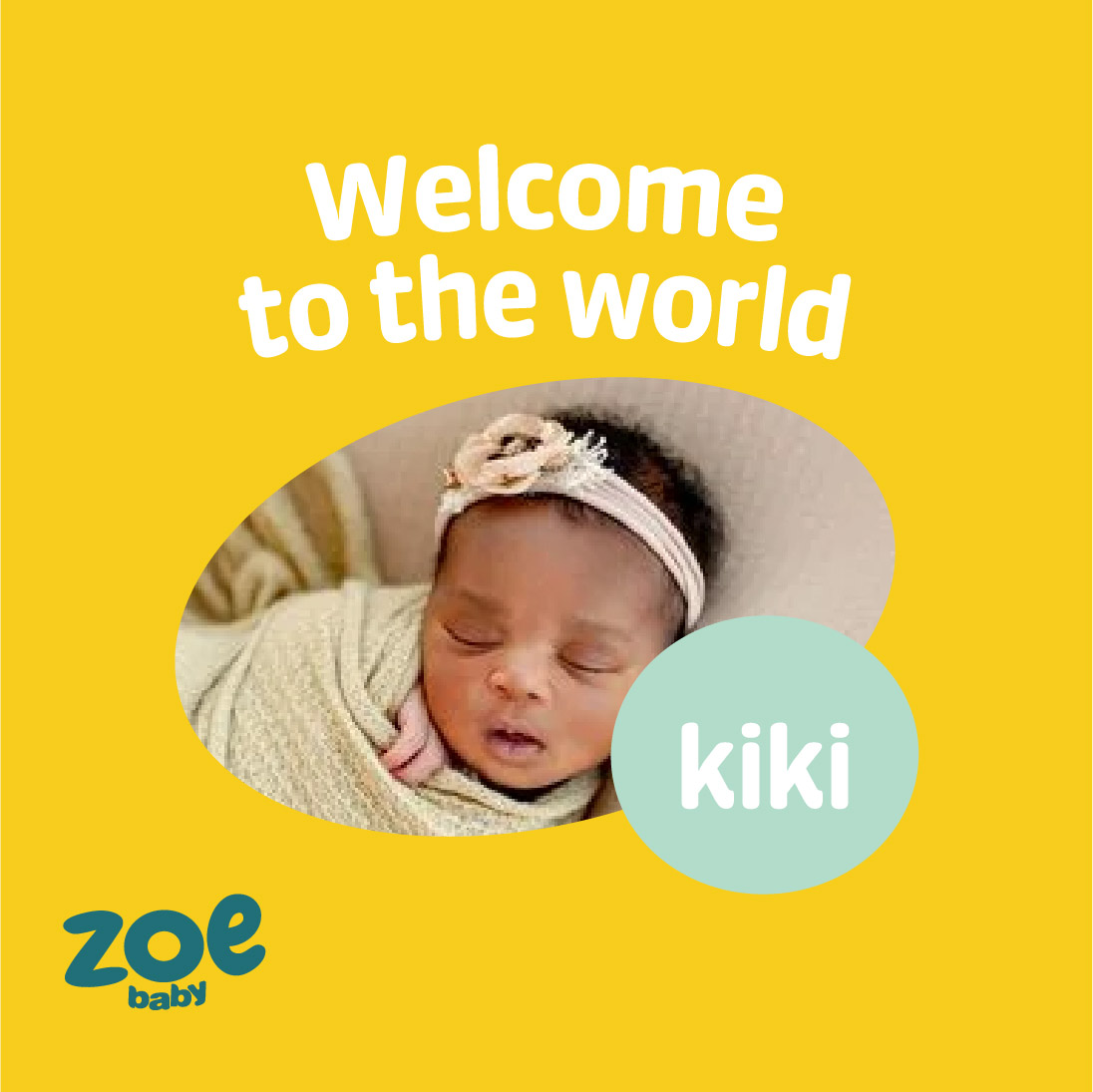
Project Summary
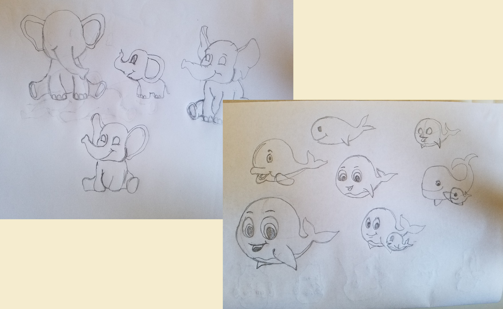
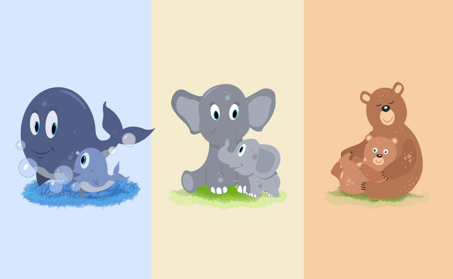
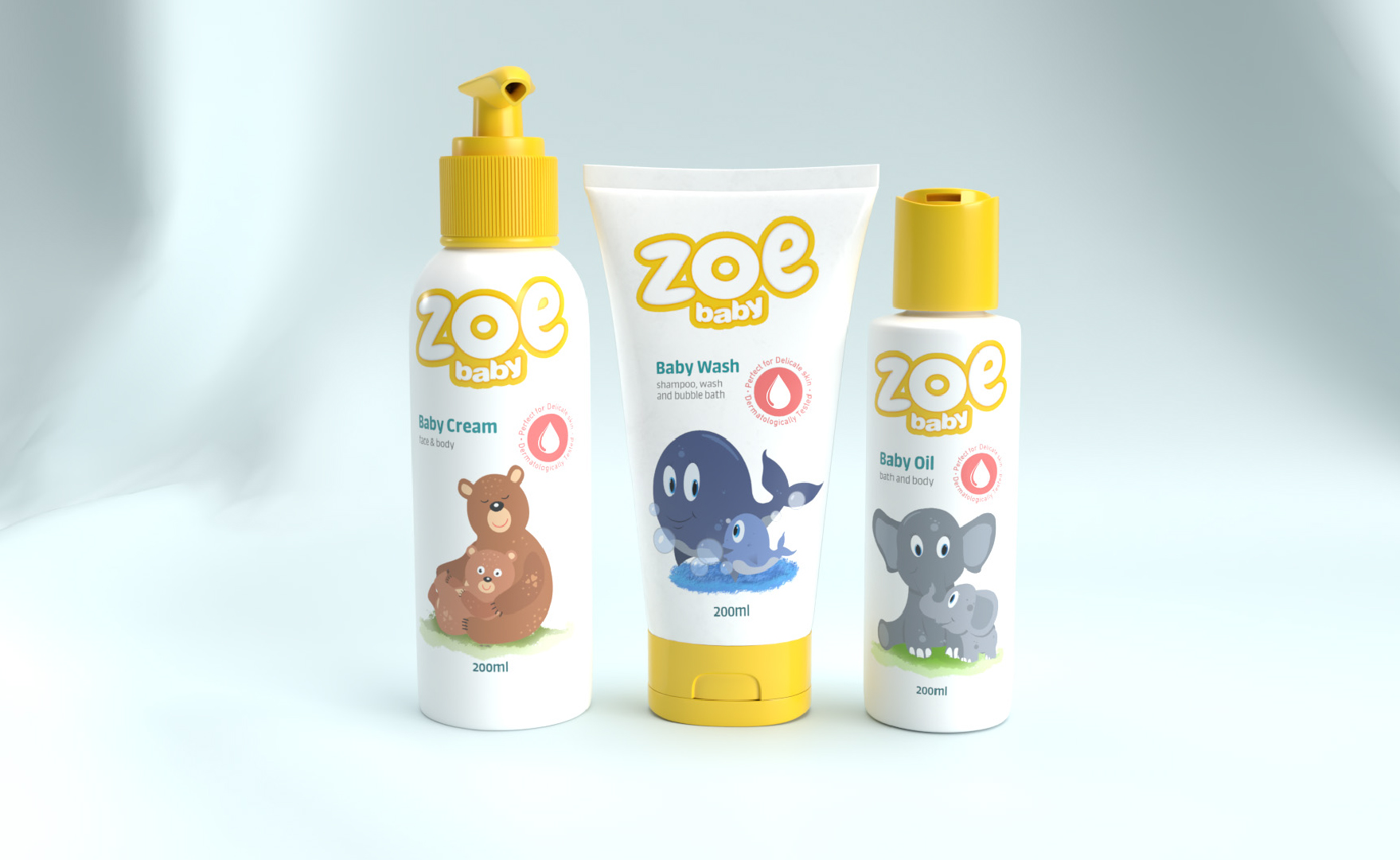
The goal of Zoe Baby is to reassure mothers that they can get excellent, baby care products for a fair price. My job was to produce a portfolio of items that adorably cared for the most priceless ones while also developing a cohesive visual identity based on the brand's positioning and strategy. The language in the logo, which also translates into a visual motif in the shape of picture frames, reflects the softness and delicateness of babies. The logo was built utilizing soft, delicate oval forms to convey this. This concept is also expanded to the color scheme that adds softness and playfulness. The goal of the baby book-inspired illustration is to arouse the pleasant feelings that come to mind when contemplating the unique bond between the mother's love and the child.