Project Summary
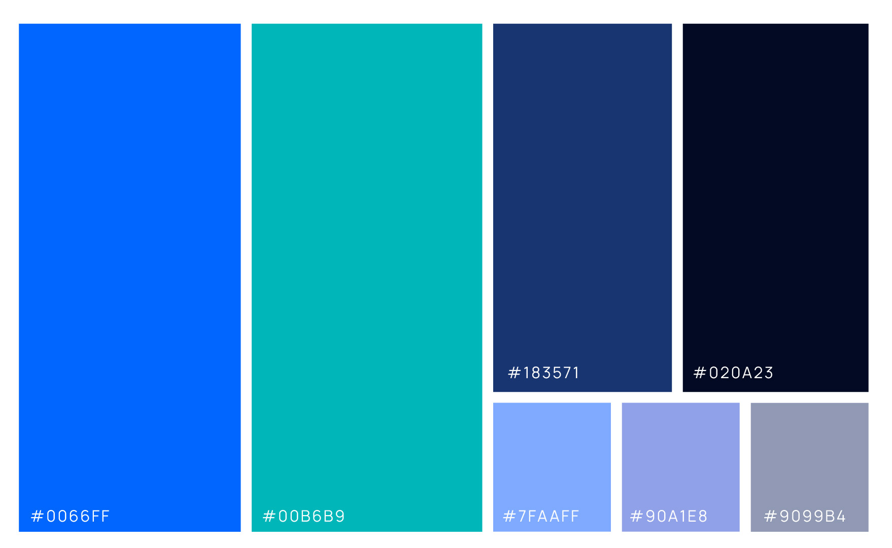
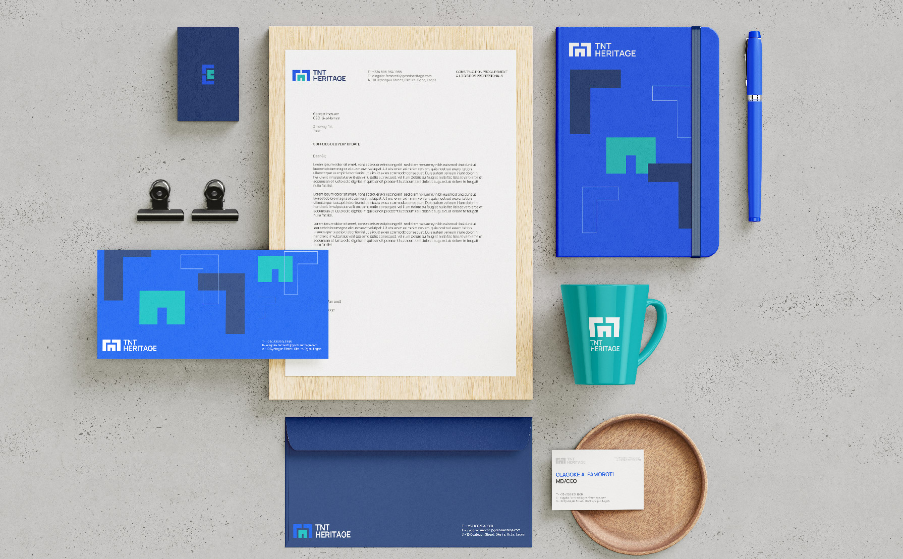
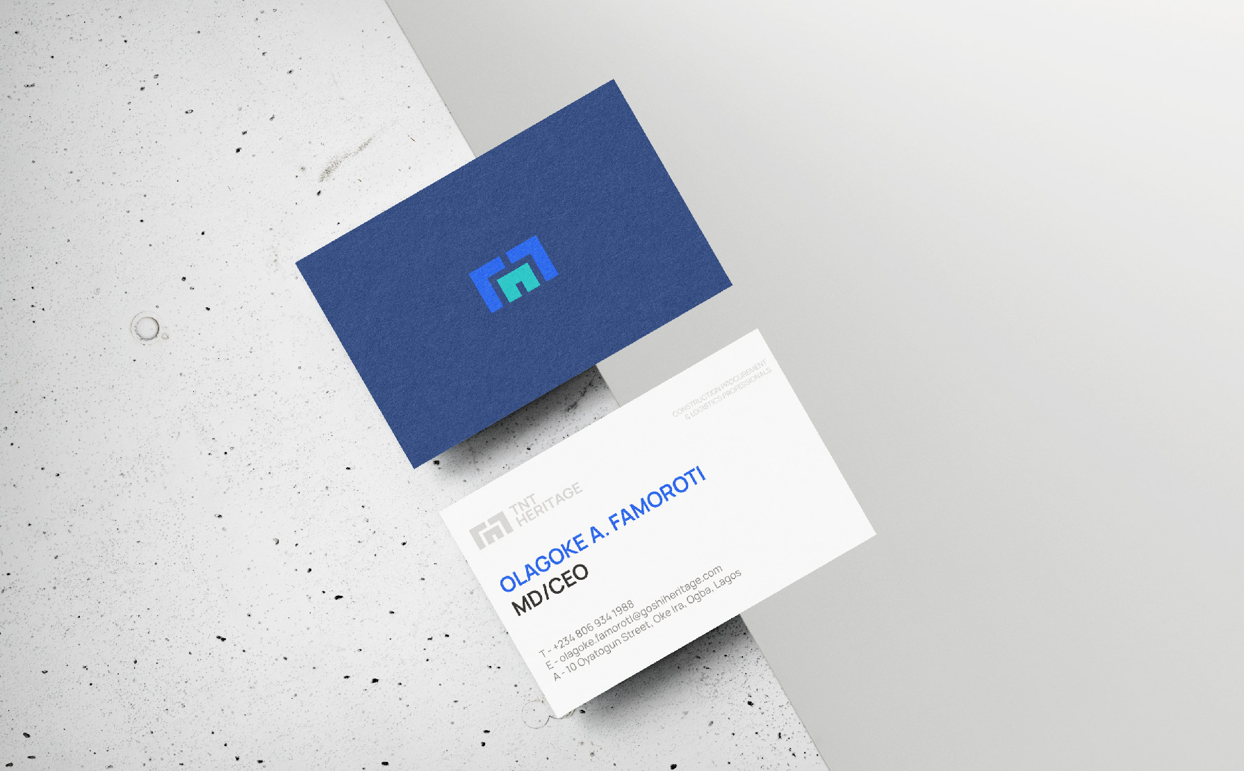
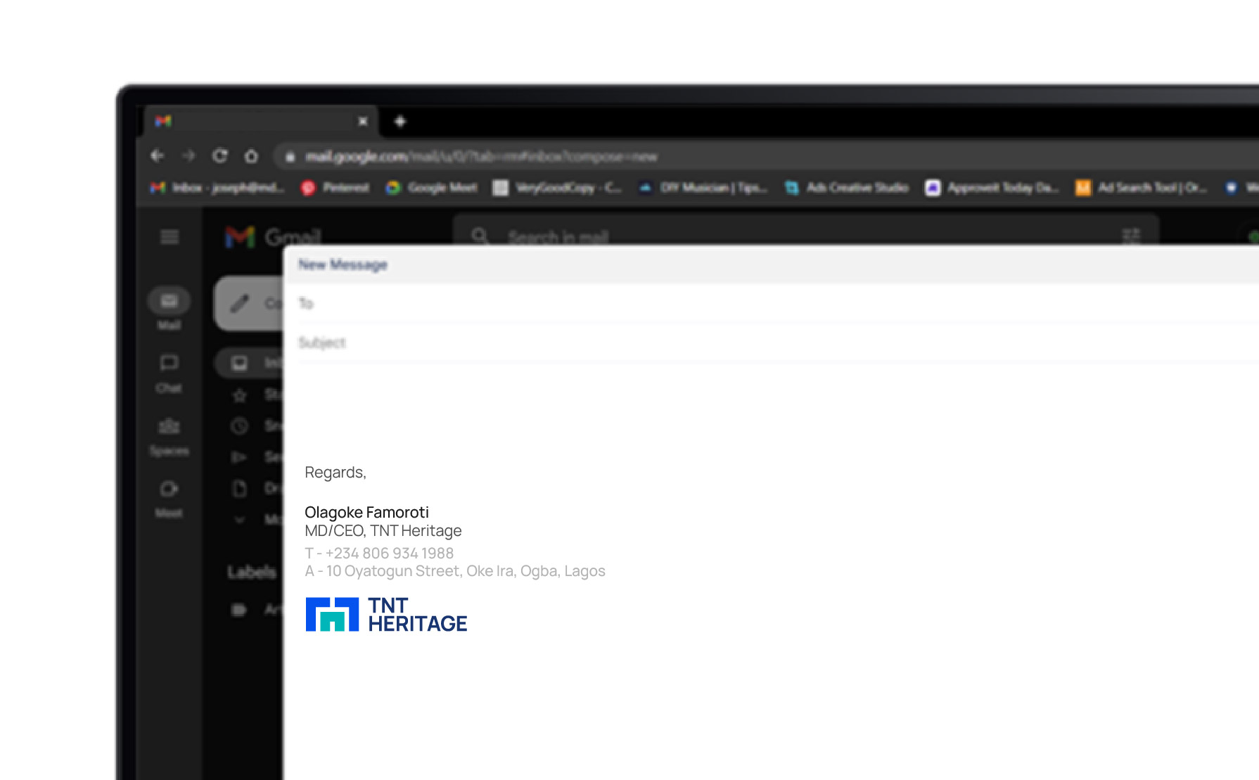
TNT Heritage is a business that provides procurement and logistics services to construction companies. As part of their branding efforts, they required a visual identity that communicates their reliability and sturdy approach. The Logo, designed to depict a sense of sturdiness and robustness is achieved by incorporating bold, geometric shapes, and using strong, solid lines. To complement the logo, a set of brand patterns have been created. These patterns extend the visual identity of the logo and are designed to convey a sense of excitement and reliability. The color palette used in the branding is predominantly blue, which is often associated with trust, dependability, and professionalism. The visual style developed for the brand is being extended across various marketing collateral, including business cards, stationery, and social media assets. The result is a cohesive and consistent brand image that reinforces TNT Heritage's position as a reliable and trustworthy partner in the construction industry.


